The Presenter’s Superpower – A conversation with David Adler, CEO at BizBash, and host at GatherGeeks Podcast.
It was an honor to share a moment with David Adler at GatherGeeks, talking about what makes a presentation great, and what mistakes to avoid.
The following is not verbatim and is an annotated transcription of the episode. I disagree with David and correct myself as an afterthought. You can also listen to the podcast episode:
In the intro, Beth Kormanik asks David Adler what is Death by PowerPoint and about this love-hate relationship we have with the tool. David explains the phrase from the audience’s point of view, when you are at a meeting or conference and see a slide filled with bullet points and words on the screen, and you want to kill yourself before the presentation even begins.
But I disagree. It is not the audience’s death that’s at stake.
David also explains that he uses Prezi because it’s a platform that let’s you use images, videos, and other elements all in one place without the fuzz of having to manage different tools.
I disagree again… Keep reading to find why.
I also entirely dodged a couple of questions. Read more (or listen to the podcast episode) to find out.
The conversation starts with David commenting on this thing of people “dying” because of all the thoughtless PowerPoint presentations out there, and the Death by PowerPoint phenomenon, and asking my opinion.
Pablo: Well, for me, death by PowerPoint is the presenter’s process end. The death of your efforts to communicate and connect with an audience. The death of your sales process, the death of your brand launch, not the actual audiences’ death. Your audience is well alive and chatting with their friends about tonight’s party, while you talk-at-them.
David: So then how do you go from death by PowerPoint to engagement by PowerPoint, or engagement by any presentation shells. Certain presentation shells have a bad rep, like PowerPoint. But people use PowerPoint all around the world.
Pablo: There is no such thing as “engagement by PowerPoint” unless you are a PowerPoint guru, a PowerPoint design expert. If you are a speaker, or a sales professional, in most of the cases, your specialty is not making presentations but speaking or selling.
Note: People use PowerPoint around the world because it is the de-facto model for presenting. Culturally accepted after 30+ as the only solution in the market. The status quo, ingrained in the way we think about presentations.
David: People think it’s fun to create PowerPoint presentations because they see all the things they can do, and all these graphics. And, usually, the result is terrible.
Pablo: I think that people “used” to think that it was fun using PowerPoint, maybe 10 or 15 years ago. But today we’re flooded with tools to create presentations in different ways. I am biased towards Prezi because I am a Prezi Expert, I help people and companies to implement Prezi.
But it is far more fun to create a presentation in Prezi, navigate your way through, and have your own adventure. And have levels and dimensions were you don’t need to be a professional designer or know a lot of PowerPoint tricks, but just to put the content where you want for your presentation.
David: Before we talk about how to create a Prezi presentation, let’s jump through the different technologies. You are an expert in Prezi, which I happen to use. But there is PowerPoint, there is Keynote, there are a lot of different new ones.
Pablo (dodged question entirely – ask me why!): There are hundreds. PowerPoint, Keynote, Google Slides. A ton of small startups (showing up for specific niches). And so on.
The problem is that they are all (or almost all) based on slides. Using the concept of one slide after the other, like pages on a book. Instead of having a multi-dimensional model that you can approach from different sides and in different ways, depending on how, to whom, and where you are presenting.
David: I use Prezi. Why is Prezi better, in your opinion, than the typical slides? What makes it more engaging. What about it is so interesting?
Pablo: I don’t know if engaging is the right term. Prezi is easier to understand and more memorable.
David: Because of the audio and the video…
Pablo: No. It is because of Spatial Cognition. The ability of our brain to relate concepts to locations.
David: Right. What do you lose when you use slides on the screen? What’s the difference, though? What’s the UVP of Prezi vs. PowerPoint?
Pablo: Because Prezi leverages spatial cognition. And has a mind map-like structure. A mind map is when you dump the content (of your brain, or your presentation) on canvas and distribute the content through that canvas to represent different ideas. Your brain, your mind, will remember that canvas because concepts are in various positions of that canvas. Slides are like a book, pages disconnected from each other. One slide and then the next, instead of having one view transition into the next.
David: So, are you saying that when we are talking about Storytelling that the spatial cognition approach is more conducive to Storytelling?
Pablo: Yes. It greatly helps with Storytelling, yes, of course.
David: So you think that would be, in a larger audience, even more important to use those techniques. Right? To allow a larger group of people to understand, through spatial cognition.
Pablo: The size of the audience doesn’t matter. What matters is how you deliver that presentation. It is not the same if you deliver a presentation to three people than to a thousand, but the concept of spatial cognition is valid on every setup.
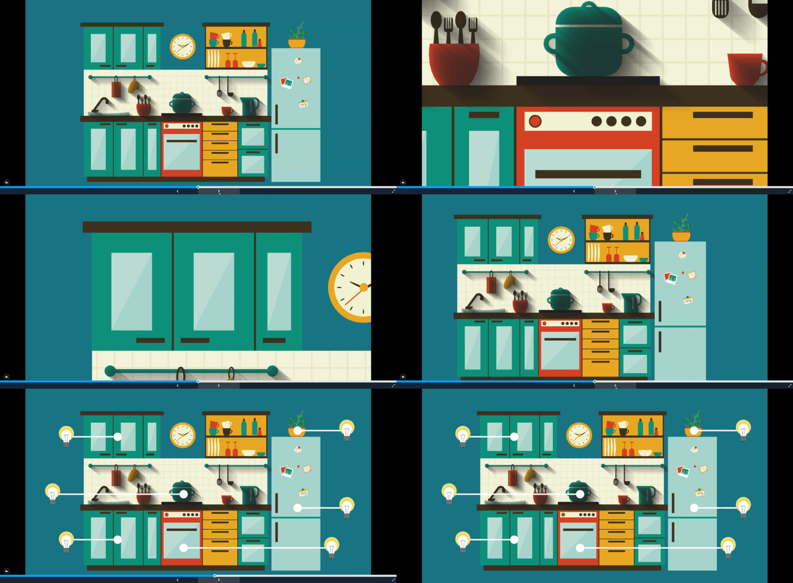
At this point in the conversation with David, I invite the listeners to do a quick experiment with me, to play a short game. This experiment cannot be conveyed with written words because it loses perspective. Instead, I am using a visual way to convey the same concept (listen to the podcast episode for the alternate version):
This is the PowerPoint way:

This is the Prezi way:

Pablo: It is easier for the mind to understand and remember things when they are attached to locations (physical or visual locations.) So, in a canvas, where we have different sections, and we can attribute meaning to those locations, it will be easier for our brain to understand, process, and remember that.
David: So that, in a nutshell, is the difference between PowerPoint or Keynote, and Prezi, which is a completely different approach.
Pablo: Another power of Prezi is that it facilitates Storytelling. Because of its nonlinear structure, it is easy to create a presentation with plenty of storytelling. The basic concept of Prezi is that you have containers with information. You create new boxes (topics), and you add data into those containers. And that’s all there is about creating a Prezi presentation.
David: So now, we are at an event… We’re about to present to a big audience on stage. What is the best approach to do that? You are talking about the combination of Storytelling and enhancing the speaker. How do you help people do it?
Pablo: I help people in two different ways. One is creating their presentation; they tell their story to me and give me their assets and materials and pictures and videos, or ideas and concepts. With that, I deliver back a visual tool that they can use to tell their story. But also how to tell a story, to connect, and to deliver that message effectively. And I think that the cohesive element on this process is your intimate relationship with your own story, the story that you are telling. You can’t fake that. I mean, you can, but the result is not the same.
David: There are certain types of stories that people tell. Why don’t you tell us what some of these types of stories are? Because depending on the story you want to tell, the kind of story you use becomes more critical. What are the different story types, for the people that are listening to this podcast?
Pablo: There are story types and story structures (or frameworks).
There are seven story archetypes used in business or practically any setup, and are:
- Overcoming the Monster
- Rags to riches
- The quest
- Voyage and return
- Comedy
- Tragedy
- Rebirth
However, all of those types of stories can all be structured in a three-step story. Where you start with a struggle, a problem, and you undertake a quest, a journey, to solve that struggle, and then you come out from that journey or adventure, changed yourself and with the solution. This is the framework to tell any of the seven types of stories.
The three-step structure is the simplest, and there are also five-step frameworks, the Hero’s Journey, and so on. There are different frameworks. I suggest, if this is the first time, or your first approach to Storytelling, to use the Hero’s Journey with a three-step structure, which is the simplest and most effective. It is the one that always works.
The Hero’s journey is basically, the adventure of our Hero. Your Hero is each participant in your audience or guests in a meeting.
In an investor’s presentation, your Hero is your investor, in a sales presentation, your Hero is your prospect. And they face a struggle, different kinds of conflict. That struggle is almost always related to WHY are they there in that particular moment. The story that brings them to look for a solution. What’s my story, or the story of the company I work for and all those stories combined.
(ERRATA: I take advantage to correct myself here, the Hero in a funding conversation is you, not the investor. Refer to this article for clarification)
And the framework is the story, the problem to solve, the adventure or quest undertaken to solve that problem, and the resolution, where the Hero comes out of that journey victorious, with the solution. He’s changed himself.
We can make a story more or less dramatic depending on the setup, the situation, the audience.
But the structure is pretty much always the same:
- A problem or struggle.
- The quest, or adventure, to solve (or dissolve) that problem.
- And the Hero comes out, the winner with a solution or whatever the resolution is.
David: So. Okay. We got the story types and structure together, what is next for the person giving this presentation. When they are talking to you about their performance, do you help with the script as well, or are you just helping them with enhancing the story that they wrote? Or are you helping write the story as well?
Pablo: Sometimes I write the whole story, usually based on their story. Nope. That didn’t come out well: I don’t write my clients’ stories, only they know their stories. I help them articulate the story in a way that makes an impact, and also the visual narrative.
David: So, okay, visually, we have some rules that we have about visuals.
Pablo: A few tips:
People cannot read and listen at the same time. When you have a lot of text on the screen and are talking over it, our brain crashes (literally). The spoken word should be enough, and the visuals should be a metaphor to support the speaker’s message. One good example is having just a few words (no more than three, remember) that represent what the speaker is talking about. Keywords to help you, the speaker, to remember what you are talking about, and for the audience to get it faster and more comprehensively.
This, I think, is one of the most common problems with presentations today.
Note: The crash lingers for a moment past the struggle, and our audience will do a double-take to get back to us and our story. For example, once past that particular slide, people keep wondering if there was something different between what you said and what was written.
David: And what about the pictures and things like that. Do you think they should be used as metaphors for simple concepts?
Pablo: I prefer to keep things simple. Pictures need to be very well chosen or made (taken) for the occasion.
Another tip. Do not try to convey more than three ideas or concepts on the same screen. Use a 3×3 model. This is a very well known framework, where you use three keywords, three concepts multiplied by three topics for a total of nine ideas (top) to convey.
Three topics, each containing three concepts or ideas, and each containing no more than three keywords or talking points.
When it comes to visual elements, most of the presentations are distracting. We think that by using more colors, more parts, more effects, we will make the presentation more engaging.
But, do you want your audience engaged with the screen or with you and your message? What is your goal? The audience paying attention to what you are saying, to your message, or the flashy things on screen?
David: The flashy things are amateur stuff…
Pablo: Yes. I did that too!
David: This is cool! (laughter.) Let’s change the transitions in a million ways. Let’s do this and that. That’s the worst.
Pablo: Yes, because you are distracting the audience from you and your message.
David: You also mentioned how colors make a difference too. How can you create a mood (or disrupt it) by using different colors?
Pablo: Just a few:
Orange. Lots of energy. Uplifting.
Red. Angry. Aggressive. Overexcitement.
Blue. Authoritative. This means you know what you’re talking about.
Pantone, pastel colors to create a mellow effect. Or to not call the attention too much to that object.
Black. Premium, luxury, high-end kind of stuff.
White to create space. To let people wonder.
Everything that I am saying about colors is void, null because it depends on the context.
David: Let’s talk about green. You are not a big fan of green.
Pablo: Lol. This is just personal experience and not backed by research or data. Green distracts people because it’s related to environment and conflict. Something we are not comfortable with.
Unless the green is granted, of course, I also use green on my brand, but only some little details here and there.
David: When you do presentations, I know this depends on the context, but how long should a presentation be? We see, like TED Talks and they are 20 minutes. When you see an hour-long presentation, isn’t that overkill today?
Pablo: Yes, it is. Today, we reach conclusions in milliseconds. We didn’t use to do that. We used to consume a lot of information and research before making an opinion, a decision, or to decide to keep going with something.
Note: You need a hook off the bat, to keep your audience engaged through the entire talk.
Longer presentations are useful for conversational settings, where the performance is a conversation, an exchange. One-to-many presentations (or deliveries) should not go over 20 minutes. But this really depends on the context.
David: Let’s talk about music and video. How does that integrate into modern presentations? Because I use them to demonstrate things. Brings other people into the presentation.
Pablo: You do it very well because you add the videos with a precise scope, a specific goal in mind. Which brings us back to GOALS. When you add a video to add some flashy visuals to the presentation, or to encourage engagement without a clear idea of why you are just distracting people, but, for example, in your case, you use the video to add value. You shut up, run the video, and then talk. So you have ten speakers in one presentation. Your idea, and you do it very well.
Note: David does this part very well by bringing videos of other speakers into his talks. He effectively brings ten other speakers to each of his presentations.
David: What about audio?
Pablo: Audio. Mmmmh. Just for the intro and outro, I mean, you are talking, any sound or noise will be distracting unless you are creating an effect that supports your multimedia story. Audio effects in a talk can be funny and engaging when used to support your Storytelling.


